
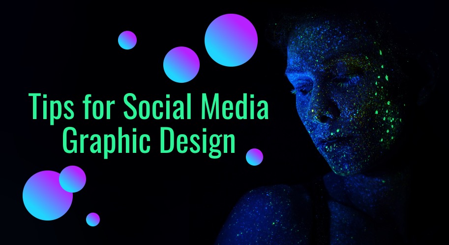
With so many brands vying for attention on social networks, it’s critical to amp up your social media posts. If you want to capture your target audience on social media channels, don’t invest in mundane designs and half-baked copy. Plus, if you have to hire graphic design experts like Penji for your social media graphics, do so for brand recognition.
Professional graphic designers know the design principles that should go into your social media posts. And if you think design principles are only integrated for the visual appeal, think again. There is a psychology behind applying design principles to any concept, for that matter. And here are the reasons why applying design principles on social media posts matters.
1) Hierarchy for easy-to-digest information
In graphic design, hierarchy is essential to display the most important information at the top. The least important information goes underneath and so on. Creating proper structure is advisable to capture social media users’ attention.
For instance, the heading should be captivating enough to make users stop scrolling and click on the post. Then the subheading must summarize what the post is all about. On top of the structure, copywriting is exceptionally crucial as well. Most marketers hire content writing services such as Content Fuel to help them with their advertising copy.
Finally, the call to action must be at the bottom part to remind users what the next step is. Overall, applying design hierarchy makes your social media posts easy to digest. And with social media channels being such busy networks, hooking your audience with your headline alone is already an achievement.
2) Color for evoking emotion
In graphic design, using the right colors is backed by psychology. Each color conveys a particular emotion, which is useful, especially when you want to promote your advocacies. Moreover, using the right colors also sets the mood for your overall social media post.
These colors will evoke certain emotions that will impact their decision-making process. There’s a reason why most fast-food chains use red in their establishment. That’s because red stimulates energy and excitement, which is how we feel when we see our favorite fast-food restaurants.
3) Typography for branding
Don’t think that fonts are for visual and communication purposes only. The truth is, typography goes beyond the visual appeal of your designs with useing web development. It certainly does more than getting your message across.
Putting together suitable typography for your social media posts should revolve around your branding. Serif fonts are fit for companies that want to emanate a more professional and traditional branding.
On the other hand, sans serif fonts are more suitable for more modern and cutting-edge companies. Script fonts are also better for companies with formal or feminine branding. Last but not least, decorative fonts can be used to represent brands that are more playful and adaptive.
4) White space to improve visual communication
White space or negative space should also be applied to your social media posts. Integrating white space every once in a while lets the eyes breathe when soaking in information. White space also amplifies the other design elements on your social media posts.
And with users constantly scrolling their feeds, this can be excellent to capture their attention. When one element pops out of the design, it can act as the hook that reels users in. Letting the most essential elements stand out can ensure you visually communicate your message.
5) Lines and curves for guidance and movement
Whether you’re posting on social media to garner conversions or followers, including lines and curves is excellent for guidance and movement. Lines can guide the users’ eyes to the information you want them to focus on. This is great if you want straightforward posts that aim to convert users.
Also read:- write for us technology
Moreover, curves also imply movement. Using curves can be useful for sports and apparel brands to depict constant activity and action.
6) Balance to make users focus
Balance creates harmony in social media posts. You can play with balance by using asymmetrical or symmetrical designs. Balance gives other design elements a certain weight. Furthermore, integrating balance into your designs also sets a focal point.
Also read:- Technology write for us
Focal points are the most evident design component that users initially look at. When you use balance, it adds visual weight to elements you want users to focus on.
7) Repetition for brand recognition
Another design principle that you MUST apply to all your social media posts is repetition. Don’t just randomly pick the color palettes, typefaces, and symbols. Make sure that all of those design elements represent your branding.
Also read:- write for us tech
Check your brand style guide every time to ensure that you represent your company in the best light. And ensure that you consistently use these branding assets to instill brand recognition within your target audience.
Conclusion
Applying design principles on social media posts will undeniably hook more of your audiences. If you don’t know where to start, it’s recommended to entrust this task to the experts. Subscribing to Penji means you’ll get access to fast, professional, and affordable social media designs. Try Penji’s services for 15 days if you want your social media posts to create buzz online.
Author bio:
Hello, I am a professional SEO Expert & Write for us Technology blog and submit a guest posts on different platforms- we provides a good opportunity for content writers to submit guest posts on our website. We frequently highlight and tend to showcase guests.